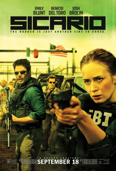
One of the biggest ways movies capture their audience’s attention is through the use of different fonts. This can represent a great deal about a movie, with just the way the title is written. In crime movies, I took notice that the titles are generally very short. Examples include “Sicario,” “Narcos,” and “Making a Murderer.” Another notable feature of the font was the boxy look of it. The letters are quite large and eye-catching and are very dark to garner the audience’s attention. This information is useful because during the “distribution and exhibition” phase of the project, learning about the techniques behind the fonts helps to know what will draw in a bigger audience. An effective movie poster can go a long way in selling a movie to the public. Titles of movies find a way to effectively give the audience an idea of what the movie is about, without revealing too much information. The definition of Sicario is a hitman or hired killer, so having this as a title reveals that the movie will be based around this theme and gives the audience a perception of the genre as well.
https://fontmeme.com/movie-fonts/crime/
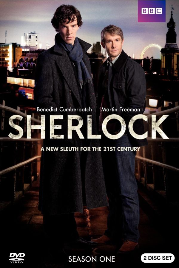
In the television crime drama “Sherlock”, the font is also in big, blocked letters. In this example, the title is white with black undertones and fades on top. This could represent how there is darkness within the good in crime genre movies and this title seems to effectively establish a crime feeling.