I am very excited to say that we are on our last phase of editing! All we have left are the title cards and the credits that will be playing throughout the beginning section of the title sequence. Honestly, Taylor is a wizard and somehow crafted the beauty that is our title card. It is probably better explained in the screen recording video itself of what she did, but I will briefly explain it. She made the screen of “Into the Truth” and to get the magnifying glass effect running over the words, she used Video Star to overlay a green screen on top of the video. Then she made the green only visible in the middle of the magnifying glass, which allowed for the transparency over the words. By removing the green screen from the rest of the screen, this allowed for the other portion of the screen to be seen without anything blocking it. Then she moved the magnifying glass over the words and somehow BAM we have the finished product, and it looks so perfect! This was a really exciting part for me and Taylor because it signified the ending of our movie but also it was just a really cool editing trick that she was able to pull off.
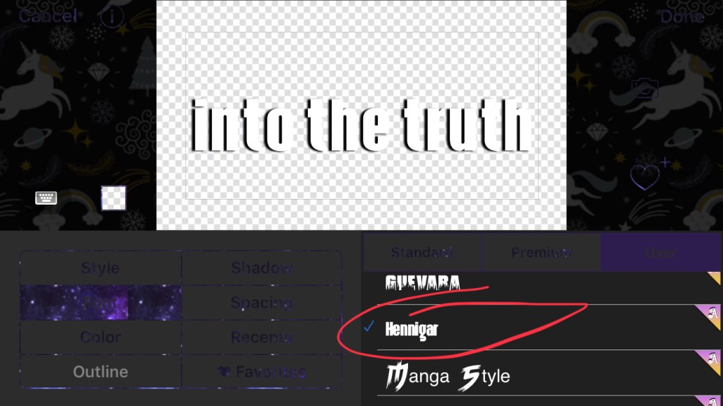
The next part of editing we had to do we as mentioned, the titles. This is where the credits go of who is the cinematographer, editor, director, etc. This may seem like an unimportant part of the process, but it is actually very vital. Each genre has different fonts they use that just reinforce that genre more. Through our past research we found that most mystery and crime movies typically will use fonts that have big, uppercase, blocky letters. So this is exactly what we used.